MONTHLY FEATURES
APRIL 2004 NEWSLETTER US DIVISION
Members will have noticed that the US pages carry an earlier date than the main newsletter. This is because the US page is added to the main paper newsletter when it is circulated in the US in arrear of the UK edition, so it is actually published between UK paper editions.
|
|
|
| original size page 1 (3 MB) | original size Page 2 (3.1 MB) |
FADING FARNBOROUGH
It’s
the beginning of September so it must be time for Farnborough. Sorry, no – but
its two years since the last one. Now I remember – they moved it to July so it
must have been and gone and nobody noticed. So
different from when it was as much a fixture of the UK year as the cup final,
Ascot and the various Bank Holidays. Also for many I guess it signalled “back
to school”.
One
reason for the fading public status of the show must be the globalisation of the
industry. When the first SBAC show was held at Farnborough after WW2, (there had
been one earlier at Radlett) the rule was British, All British and nothing but
British. Even then I am sure there were
many US components like electronics but the rule was British airframe, British
engines. By the 1960s this had become untenable as, with the cessation of
manufacture of light aircraft engines by DeHavilland and Blackburn,
flat-four engines from Lycoming or Continental had to be imported for
such as the Beagle series. Comeptition
with the Paris show meant that a fully “open to all” Farnborough was not far
behind. This competition was partly diminished when the two shows agreed to be
held in alternate years. It was also a recognition that nothing new gets built
in under twelve months.
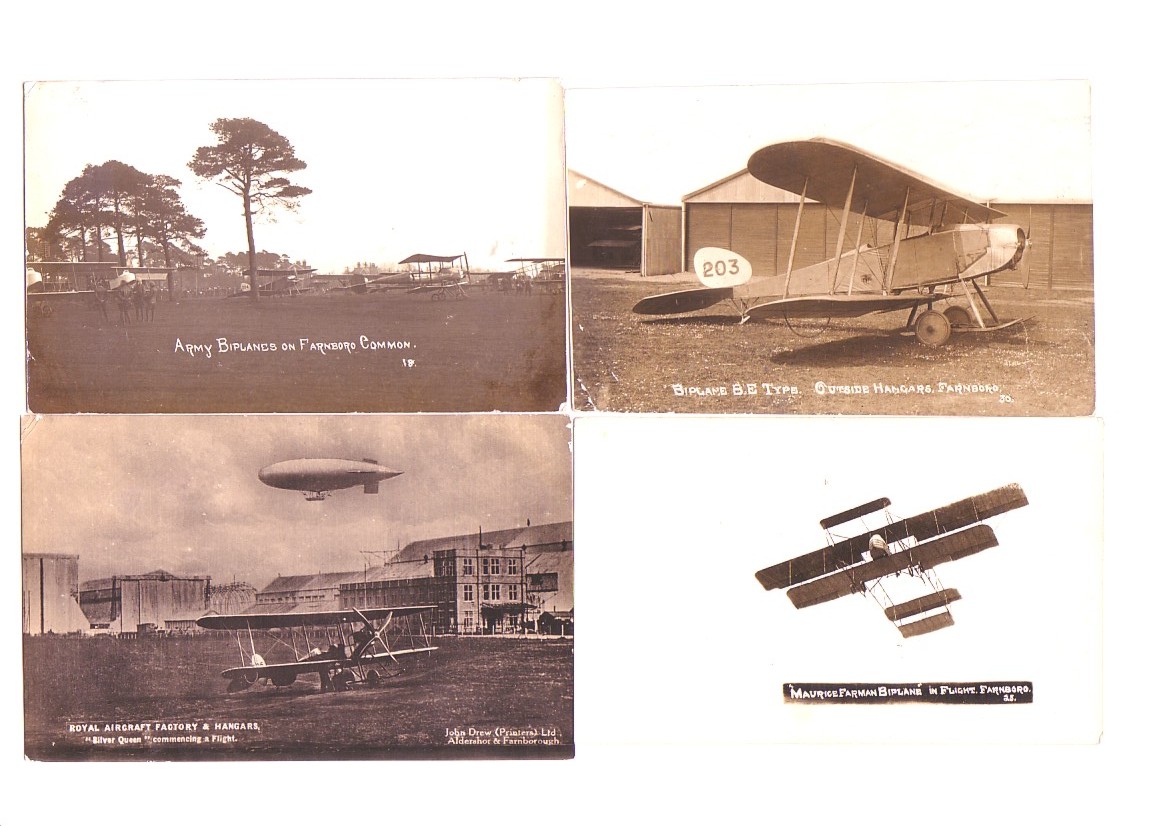
Postcard-wise
Farnborough is a game of two halves. Its
most prominent period was just before WW1, as home of the Royal Aircraft Factory
and adjacent to the home of the British Army and its Flying Corps at Aldershot.
Many high quality photographic cards were produced by military photographer John
Drew and also by Scovell of Aldershot and seven are shown.
These
four consist of 3 by Scovell of Aldershot “Army Biplanes”, BE Type outside
Hangers Farnboro & “Maurice Farman Biplane in Flight Farnboro”. Also the
“Royal Aircraft Factory & Hangars” by John Drew.
Three
more by Drew “Flying on Farnborough Common”,
Farman , and H M Airship
“Gamma” and a more recent Campkins card of the Airbus
A.300 prototype at the Show
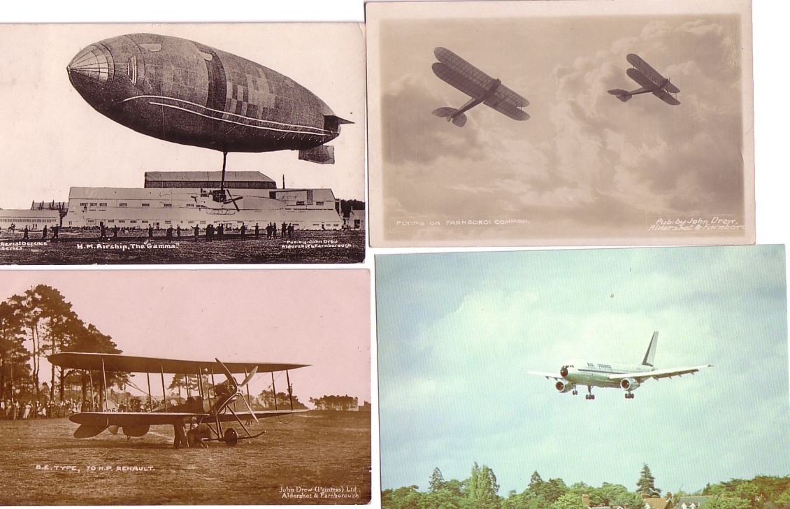
By comparison the “glory years” of the show produced hardly any specific Farnborough postcards but a few unacknowledged Farnborough views turned up on cards with the familiar back-drop including the commentators favourite reference points “the black sheds” and “ the Laffens Plain end”. The type in view is equally likely to be a vintage model from public air display than a current prototype. In the 1970s publisher Campkins of Cambridge produced a small set, some of which actually recognised their Farnborough origin. One such, shown also above recognises the new. International Farnborough with a landing shot of the prototype Airbus A.300.
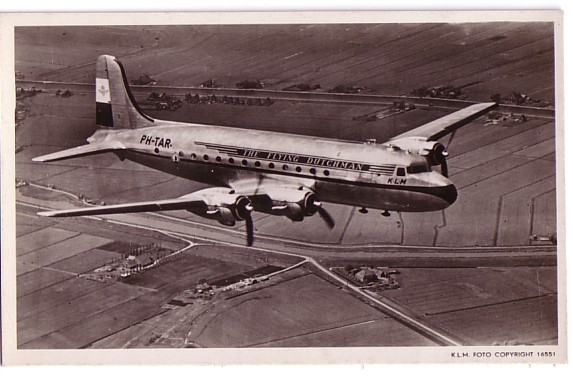
DE VLIEGENDE HOLLANDER –
THE FLYING DUTCHMAN
From
1945 to the late 50s KLM Royal Dutch Airlines aircraft carried the text “De
Vliegende Hollander” on one side and “The Flying Dutchman” on the other.
This card of a DC-4 PH-TAR shows the scheme. This card was also produced with ID
revised to PH-K.L.M in a 30th anniversary set in 1949 and PJ-KLM with
Spanish text for KLM in the West Indies.
Throughout
its long history from 1919, the Dutch airline has been a little more inclined
than most to show its aircrew on postcards.
In the
early twenties both KLM and Imperial Airways in the UK sought to publicise their
pilots by the same method, postcards with a pre-printed autograph.
I get the impression that the KLM series was more extensive and the cards
were black and white, not sepia like the Imperials.
Shown is G Geysendorfer posed with a Fokker F.VII, one of which the
piloted on a privately chartered first KLM flight to the East Indies (Indonesia)
in 1927.
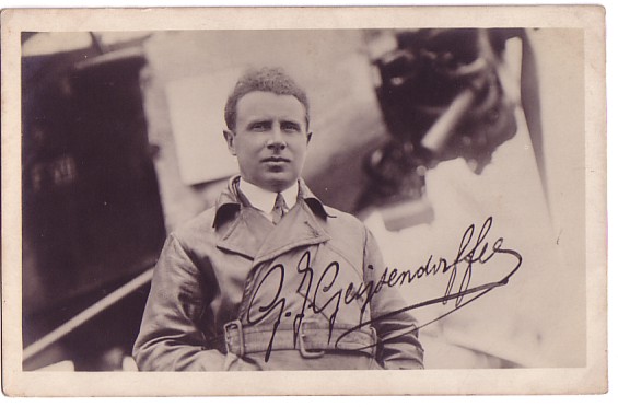
Later as
Commodore of KLM, he was loaned to the
Pander company to pilot their Postjaeger mailplane in the 1933 competition for
the east Indies mail contract, only to withdraw at Brindisi with engine failure
The KLM
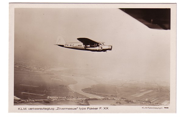
entry the Fokker F.XX Zilvermeeuw,
did not
even start but KLM won the competition using a standard fleet F.XVIII “Pelikaan”.
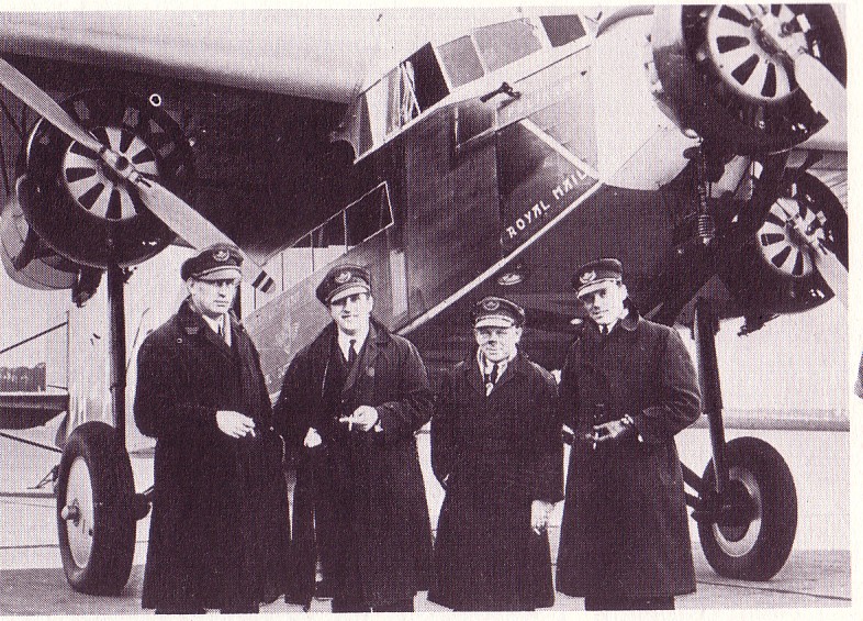
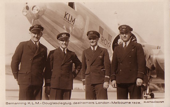
KLM issued a card of its crew, captained by Ivan Smirnoff previously of the
Russian Air Force in WWI. Left to right Smirnoff, co-pilot Soer, engineer Grosfeld, radio operator Van Beukering. All received the Dutch order of
Orange/Nassau.
Whereas
the cult of aviation personality in the UK and USA moved away from commercial
flying to individual distance pioneers with Lindbergh the prime US example ,
plus Amy Johnson, Jim Mollison and others in the UK and Charles Kingsford-Smith
in Australia, in the Netherlands it was the KLM crews that got the publicity.
Many Pelikaan souvenirs were produced . 20,000 people were at Schiphol
for its night landing return from Batavia(Djakarta).
Smirnoff
later surveyed UK airports for KLM services and his rejection of
Manchester-Barton as being too small and prone to waterlogging indirectly led to
the building of the current Manchester Airport. Smirnoff continued with KLM
until 1949. Geysendorfer died in a
Jan 1947 DC-3 crash near Copenhagen
on a flight carrying the Crown Prince
of Sweden.
Another
Fokker F.XVIII “Snip” made the first KLM flight to the Dutch West Indies in
December 1934. Again KLM issued a card showing Captain Jan Hongdong, co-pilot/navigator
Van Balkom, radio operator Van der Molen and engineer Stolk

The next
KLM crew to be achieve star status were the crew of the DC-2 “Uiver”, which
achieved 2nd place in the 1934 McRobertson Race from Mildenhall to
Melbourne, being beaten only by the specially constructed DH Comet Racer. The
Uiver crew appeared not only on KLM cards but also on a promotional card issued
by the makers of Ovomaltine Drink, presumed to be the Dutch equivanet of such as
Ovaltine and Horlicks. More
recently the same crew appeared on a history set for Schiphol airport.
Left to
right Radio officer Van Brugge, Captain Parmentier, First Office Moll and
Engineer Prins, Like Geysendorfer, Parmentier continued flying with KLM after
WW2, opening service to South America and becoming chief pilot. But he too, like
Geysendorfer was killed in a crash unbefitting his great experience when a KLM
Constellation hit power lines on approach to Prestwick in October 1948.
When
another race from UK to Australasia was proposed in 1953, this time to
Christchurch, New Zealand, KLM again entered, this time with a DC-6A freighter.
A set of cards was produced by KLM showing each member of the crew and other
cards came from other Dutch publishers. The race itself was something of a flop
with few competitors other than military teams from the RAF, RAAF and RNZAF. The
former flew Canberras while New Zealand entered a Hastings. The card shown is
titled First Officer J F Griffith – so this flying Dutchman was most likely
actually a flying Welshman,
Although
not a crew card in the same sense, KLM revived the “Captains Autograph” on
another DC-6 series card. This was issued, probably partly for philatelic
purposes for the opening of service to Buenos Aires and Santiago in 1952. The
card carries the autograph of named pilot
K J Rupplin von Keffikon

BARELY
AN AIRCRAFT IN SIGHT!
UK
Airline issue postcards featuring “non-aircraft” subjects.
By
Ian Hayward
There
seems to be a growing trend, among UK airlines at least, to issue postcards
featuring a range of subjects other than aircraft. In recent years, notable
examples are: Buzz, with their “3 people had an idea” cards featuring a book
case in one example and a fishtank in another; BMI (“birds”) and BMIbaby
(“arrivals”)– with the airline logo cartoon baby. The Manx Airlines
“Schoolboy” card, featuring a sorry adult male in school uniform, promoted
children’s fares to the Isle of Man, although this was not a postcard as such.
Some airlines like Buzz, to my knowledge, never got round to publishing aircraft
based cards although if anybody knows different perhaps they could let me know (Actually
this one drawing of a B.Ae146 but very hard-to-find – DWB)
![]()
Since, I
guess like many, my interest is in aircraft postcards rather than the range of
images available now, I have paid these “non-aircraft “ cards scant
attention up until now although I do have some among my collection. Certainly it
is not a new development. One of the older “non-aircraft” cards in my
collection was issued by BOAC in the 60’s and features cabin service in the
Economy cabin of a VC10, I also know that there is a companion card featuring
First Class cabin service – in those days there were only two classes of
travel!

While
there may be older cards than these, there has been a more recent tendency to
issue “retro” cards of old airline images. British Airways published, under
their “Silverwing” brand, a 10 postcard set based on original photos from
their archive. While a mix of aircraft and non-aircraft images, it included
cabin and flight deck shots from their fleet throughout the 40’s and 50’. I
bought this packaged set a few years back for the princely sum of £3.50!
Reproductions
of airline posters from the past are another subject for postcards. I have a
rather nice set of 40 cards published by Drumhoe Graphics, and printed by Beric
Tempest, that spans posters from pre-war to the 1960’s. While not airline
issue, this includes destination and other posters from; BOAC; BEA, BWIA,
Imperial Airways and the original pre-war BA – a really attractive set.
Among UK
airlines, Virgin Atlantic has to be one of the most prolific when it comes to
“non-aircraft” cards. Two of my earliest Virgin cards feature paintings of
street life in London and sumo wrestlers in Japan. In both cases, the tails of
747’s are incorporated cleverly in the scenes, reflected in a balloon (London)
and a window (Japan). I also have a range of destination postcards produced by
Virgin with paintings symbolising Athens, Tokyo, Florida, Boston, NY, LA and SFO…as
well as London. (They also issued a
portrait card of Richard Branson – as far as I know a unique event for an
industry that has had its fair share of egotistic owner/managers- DB)
![]()
Personally,
I regret what appears to be a growing trend for UK airlines to produce postcards
with non-aircraft images, sometimes totally unrelated to aviation (e.g. Palmair
Europe’s “girl on a beach”). As to why this is the case, I can only assume
it is the predominance of airline marketing departments over other
considerations. There was a time, I suspect, when a postcard with a well shot
aircraft image, or even painting, was seen as good sales promotional material
but, with pressures on airlines nowadays, sadly that seems no longer the case.
Cleverly worded cartoons, reinforcements of logo’s and other brand identities
are seen to be more likely to sell aircraft seats.
If you have views on this subject, or even examples
to add, I would be pleased to hear from you. Ian Hayward Harlequin Timber Hill
Close OTTERSHAW KT16 0NA ian.hayward@bbc.co.uk
Doug Bastin comments ….My own reaction
to Ian’s points were as follows :-
I agree with most of the sentiments, but have
relatively recently become a convert to interior shots, so I personally would
not include them in "not an aircraft" although their appeal is more to
airline social history than technical history. The same goes for crew cards, of
which there have been remarkably few, although several feature in this issue’s
KLM article. Also we have at least
one member who specifically collects non-aeroplane airline issue cards.
The
other strand which has been around since the early days has been
destination view cards, I think Handley Page did some aerial view shots about
1920. Apart from the general trend away
from paper, I guess the reasons for the vanishing airliner card might be :-
1) It is difficult to get excited about the latest slightly longer
version of very old designs like the
Boeing 737 (or in the case of Airbus, not
quite so old, slightly shorter as well as
longer but basically the same look). Maybe
we need the A380 and 7E7 to generate a bit of excitement.
2) With passengers injected into the aircraft through jetways from airports with shops blocking all airside views nobody sees the outside anyway. The commuter companies where you still often actually walk on tarmac and climb stairs seem to put out more cards than the majors. But, this recent Logo card from Swiss start-up Helvetica must count as a gold medal boring airline-issue card. I am not wasting space by showing it any larger
![]()
Want to download this section as .doc-file (MS Word)?
Click right mouse button here and use "save targeted as"