|
NEWSLETTER #48 - SEPTEMBER 2004
Members will have noticed that the US pages sometimes carry an earlier date than the main newsletter. This is because the US page is added to the main paper newsletter when it is circulated in the US in arrear of the UK edition, so it is actually published between UK paper editions.
Page 1 | Page 2
Itĺs the beginning of September so it must be time for Farnborough. Sorry, no ľ but its two years since the last one. Now I remember ľ they moved it to July so it must have been and gone and nobody noticed. So different from when it was as much a fixture of the UK year as the cup final, Ascot and the various Bank Holidays. Also for many I guess it signalled ôback to schoolö.
One reason for the fading public status of the show must be the globalisation of the industry. When the first SBAC show was held at Farnborough after WW2, (there had been one earlier at Radlett) the rule was British, All British and nothing but British. Even then I am sure there were many US components like electronics but the rule was British airframe, British engines. By the 1960s this had become untenable as, with the cessation of manufacture of light aircraft engines by DeHavilland and Blackburn, flat-four engines from Lycoming or Continental had to be imported for such as the Beagle series. Comeptition with the Paris show meant that a fully ôopen to allö Farnborough was not far behind. This competition was partly diminished when the two shows agreed to be held in alternate years. It was also a recognition that nothing new gets built in under twelve months.
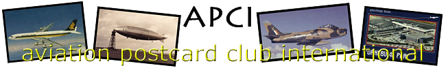
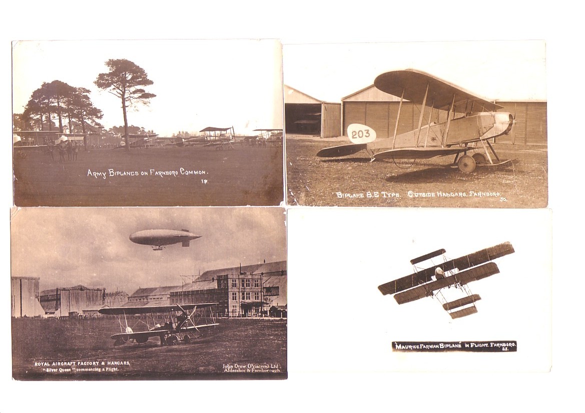
Postcard-wise Farnborough is a game of two halves. Its most prominent period was just before WW1, as home of the Royal Aircraft Factory and adjacent to the home of the British Army and its Flying Corps at Aldershot. Many high quality photographic cards were produced by military photographer John Drew and also by Scovell of Aldershot and seven are shown.
These four consist of 3 by Scovell of Aldershot ôArmy Biplanesö, BE Type outside Hangers Farnboro & ôMaurice Farman Biplane in Flight Farnboroö. Also the ôRoyal Aircraft Factory & Hangarsö by John Drew.
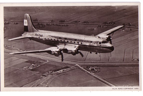
From 1945 to the late 50s KLM Royal Dutch Airlines aircraft carried the text ôDe Vliegende Hollanderö on one side and ôThe Flying Dutchmanö on the other. This card of a DC-4 PH-TAR shows the scheme. This card was also produced with ID revised to PH-K.L.M in a 30th anniversary set in 1949 and PJ-KLM with Spanish text for KLM in the West Indies.
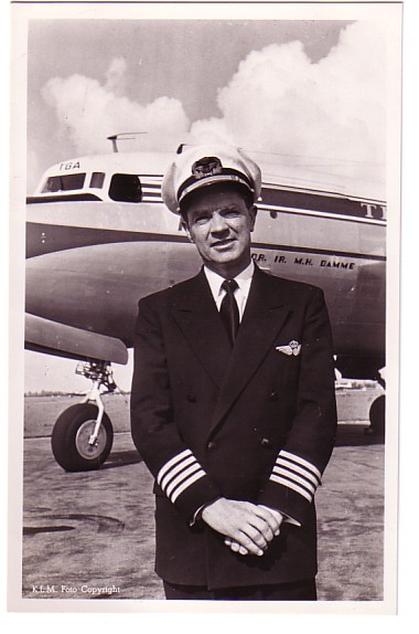
In the early twenties both KLM and Imperial Airways in the UK sought to publicise their pilots by the same method, postcards with a pre-printed autograph. I get the impression that the KLM series was more extensive and the cards were black and white, not sepia like the Imperials. Shown is G Geysendorfer posed with a Fokker F.VII, one of which the piloted on a privately chartered first KLM flight to the East Indies (Indonesia) in 1927.
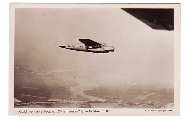
The KLM entry the Fokker F.XX Zilvermeeuw,
Smirnoff later surveyed UK airports for KLM services and his rejection of Manchester-Barton as being too small and prone to waterlogging indirectly led to the building of the current Manchester Airport. Smirnoff continued with KLM until 1949. Geysendorfer died in a Jan 1947 DC-3 crash near Copenhagen on a flight carrying the Crown Prince of Sweden.
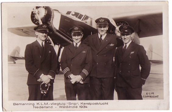
Another Fokker F.XVIII ôSnipö made the first KLM flight to the Dutch West Indies in December 1934. Again KLM issued a card showing Captain Jan Hongdong, co-pilot/navigator Van Balkom, radio operator Van der Molen and engineer Stolk
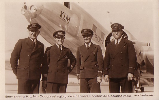
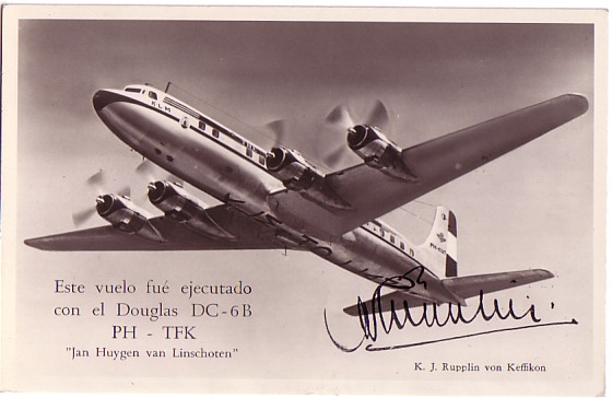
When another race from UK to Australasia was proposed in 1953, this time to Christchurch, New Zealand, KLM again entered, this time with a DC-6A freighter. A set of cards was produced by KLM showing each member of the crew and other cards came from other Dutch publishers. The race itself was something of a flop with few competitors other than military teams from the RAF, RAAF and RNZAF. The former flew Canberras while New Zealand entered a Hastings. The card shown is titled First Officer J F Griffith ľ so this flying Dutchman was most likely actually a flying Welshman,
UK Airline issue postcards featuring ônon-aircraftö subjects. By Ian Hayward
While there may be older cards than these, there has been a more recent tendency to issue ôretroö cards of old airline images. British Airways published, under their ôSilverwingö brand, a 10 postcard set based on original photos from their archive. While a mix of aircraft and non-aircraft images, it included cabin and flight deck shots from their fleet throughout the 40ĺs and 50ĺ. I bought this packaged set a few years back for the princely sum of ú3.50!
Reproductions of airline posters from the past are another subject for postcards. I have a rather nice set of 40 cards published by Drumhoe Graphics, and printed by Beric Tempest, that spans posters from pre-war to the 1960ĺs. While not airline issue, this includes destination and other posters from; BOAC; BEA, BWIA, Imperial Airways and the original pre-war BA ľ a really attractive set.
Personally, I regret what appears to be a growing trend for UK airlines to produce postcards with non-aircraft images, sometimes totally unrelated to aviation (e.g. Palmair Europeĺs ôgirl on a beachö). As to why this is the case, I can only assume it is the predominance of airline marketing departments over other considerations. There was a time, I suspect, when a postcard with a well shot aircraft image, or even painting, was seen as good sales promotional material but, with pressures on airlines nowadays, sadly that seems no longer the case. Cleverly worded cartoons, reinforcements of logoĺs and other brand identities are seen to be more likely to sell aircraft seats.
If you have views on this subject, or even examples to add, I would be pleased to hear from you. Ian Hayward Harlequin Timber Hill Close OTTERSHAW KT16 0NA ian.hayward@bbc.co.uk
şşşşşşDoug Bastin comments ů.My own reaction to Ianĺs points were as follows :- I agree with most of the sentiments, but have relatively recently become a convert to interior shots, so I personally would not include them in "not an aircraft" although their appeal is more to airline social history than technical history. The same goes for crew cards, of which there have been remarkably few, although several feature in this issueĺs KLM article. Also we have at least one member who specifically collects non-aeroplane airline issue cards.
1) It is difficult to get excited about the latest slightly longer version of very old designs like the Boeing 737 (or in the case of Airbus, not quite so old, slightly shorter as well as longer but basically the same look). Maybe we need the A380 and 7E7 to generate a bit of excitement.
2) With passengers injected into the aircraft through jetways from airports with shops blocking all airside views nobody sees the outside anyway. The commuter companies where you still often actually walk on tarmac and climb stairs seem to put out more cards than the majors. But, this recent Logo card from Swiss start-up Helvetica must count as a gold medal boring airline-issue card. I am not wasting space by showing it any larger
|

 There seems to be a growing trend, among UK airlines at least, to issue postcards featuring a range of subjects other than aircraft. In recent years, notable examples are: Buzz, with their ô3 people had an ideaö cards featuring a book case in one example and a fishtank in another; BMI (ôbirdsö) and BMIbaby (ôarrivalsö)ľ with the airline logo cartoon baby. The Manx Airlines ôSchoolboyö card, featuring a sorry adult male in school uniform, promoted childrenĺs fares to the Isle of Man, although this was not a postcard as such. Some airlines like Buzz, to my knowledge, never got round to publishing aircraft based cards although if anybody knows different perhaps they could let me know (Actually this one drawing of a B.Ae146 but very hard-to-find ľ DWB)
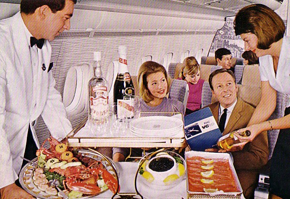 Since, I guess like many, my interest is in aircraft postcards rather than the range of images available now, I have paid these ônon-aircraft ô cards scant attention up until now although I do have some among my collection. Certainly it is not a new development. One of the older ônon-aircraftö cards in my collection was issued by BOAC in the 60ĺs and features cabin service in the Economy cabin of a VC10, I also know that there is a companion card featuring First Class cabin service ľ in those days there were only two classes of travel!
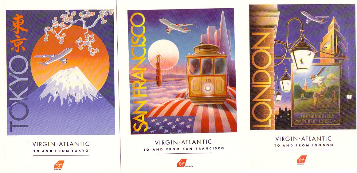 Among UK airlines, Virgin Atlantic has to be one of the most prolific when it comes to ônon-aircraftö cards. Two of my earliest Virgin cards feature paintings of street life in London and sumo wrestlers in Japan. In both cases, the tails of 747ĺs are incorporated cleverly in the scenes, reflected in a balloon (London) and a window (Japan). I also have a range of destination postcards produced by Virgin with paintings symbolising Athens, Tokyo, Florida, Boston, NY, LA and SFOůas well as London. (They also issued a portrait card of Richard Branson ľ as far as I know a unique event for an industry that has had its fair share of egotistic owner/managers- DB)
 The other strand which has been around since the early days has been destination view cards, I think Handley Page did some aerial view shots about 1920. Apart from the general trend away from paper, I guess the reasons for the vanishing airliner card might be :-